running a-z
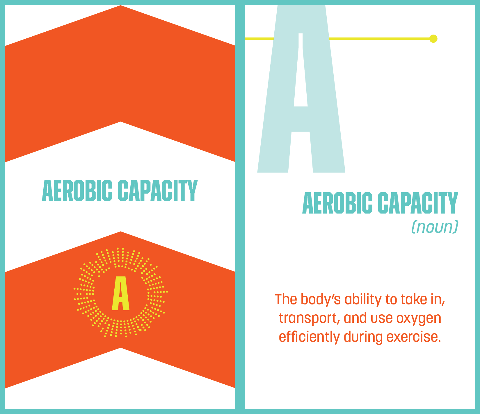
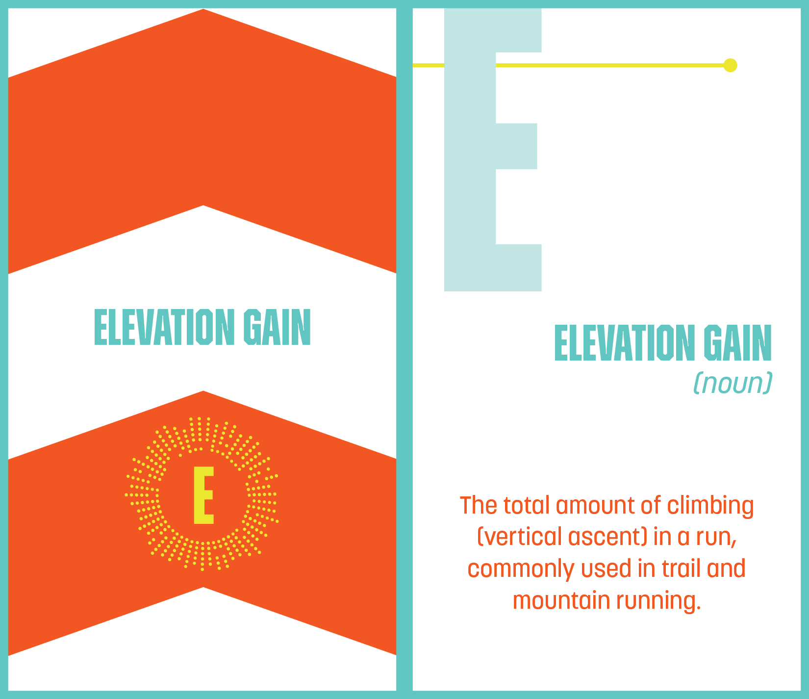
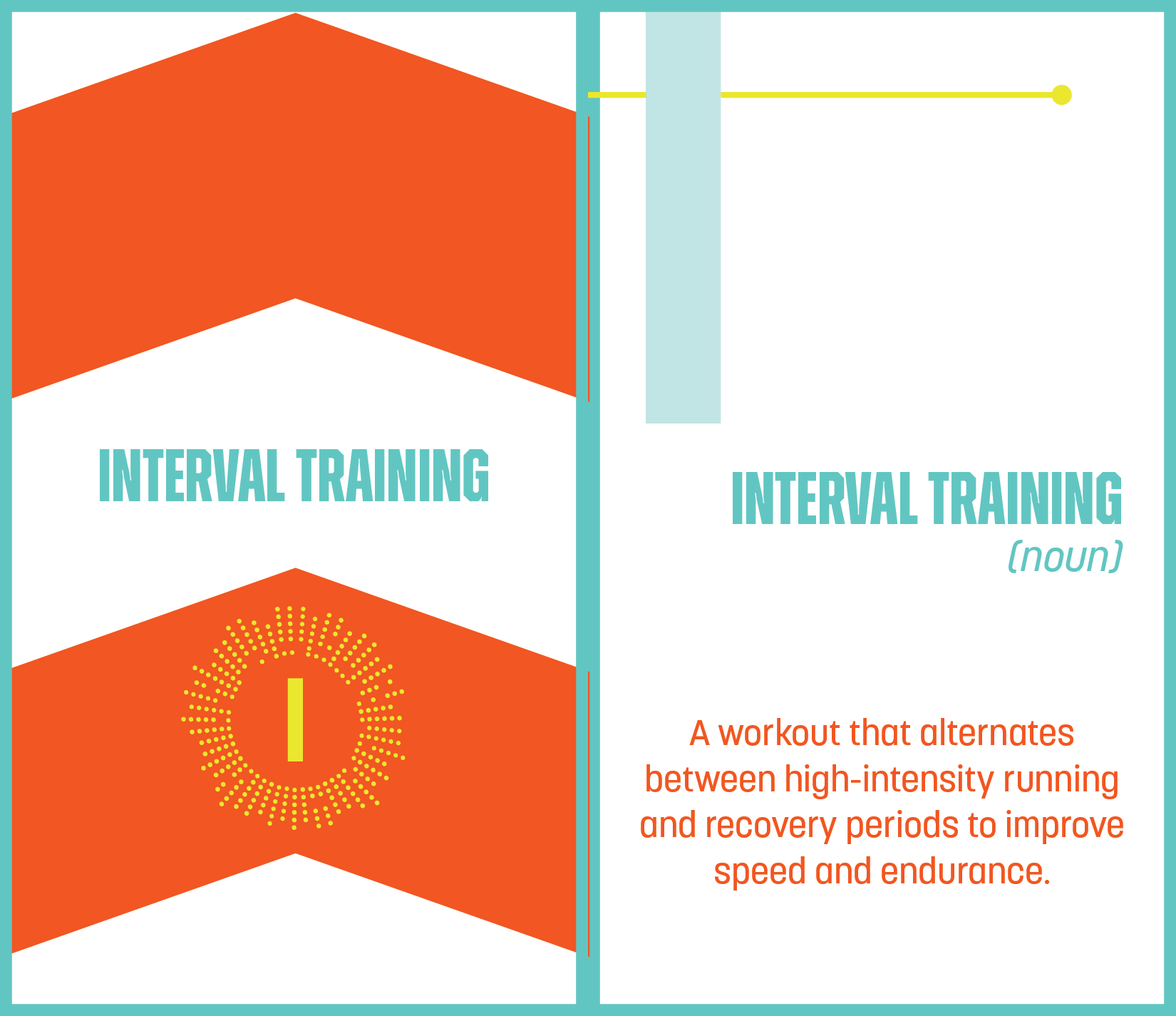
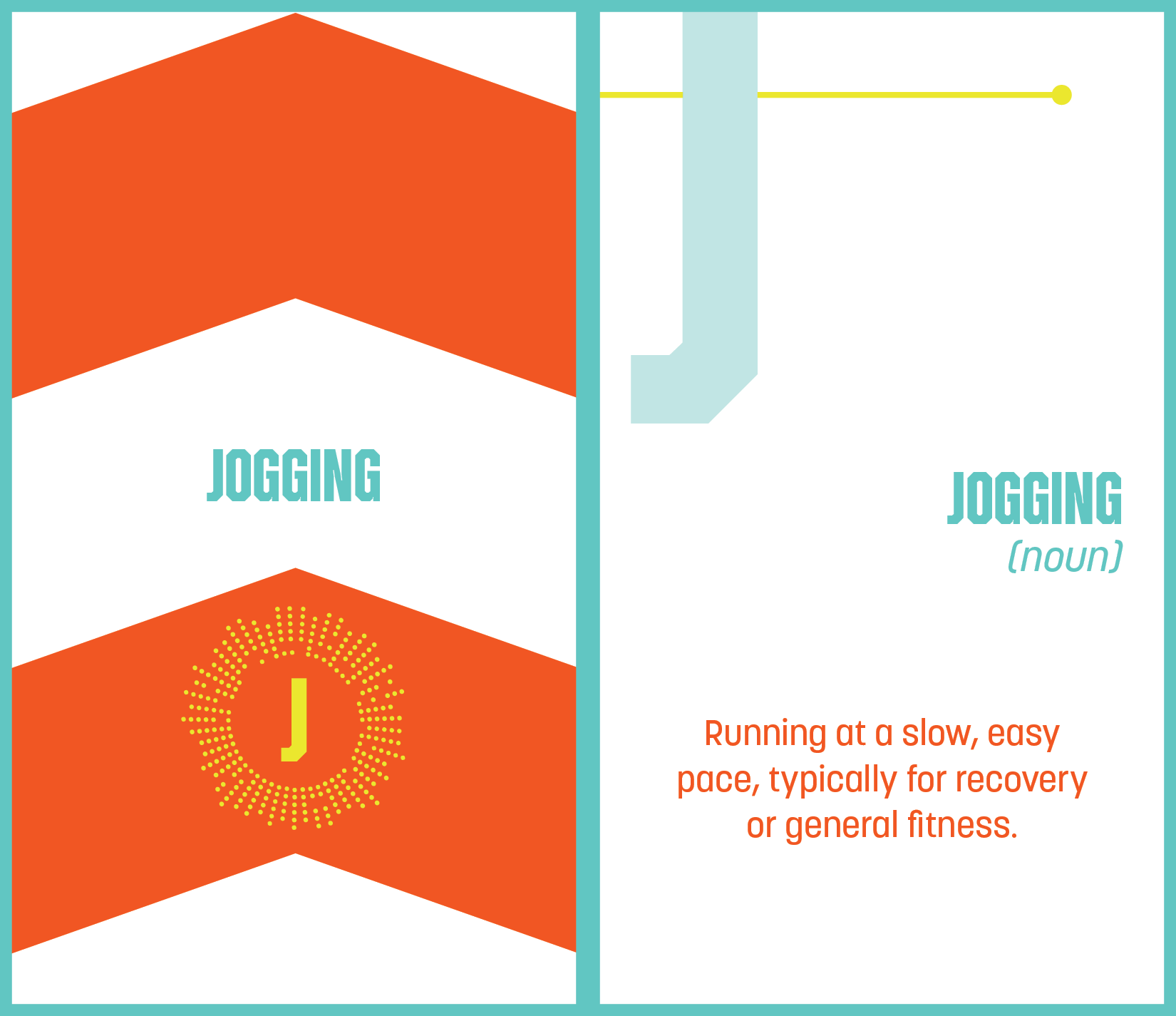
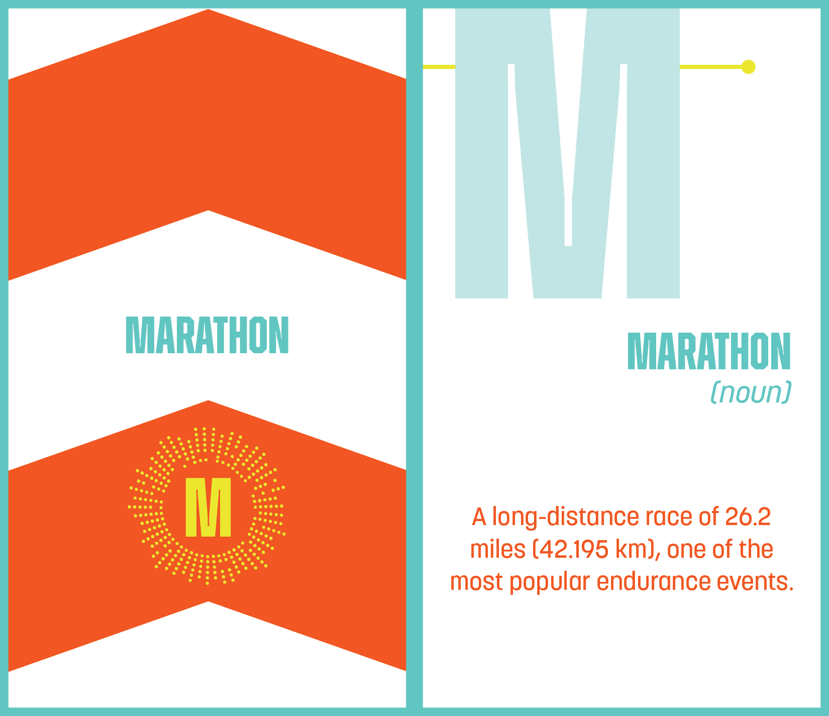
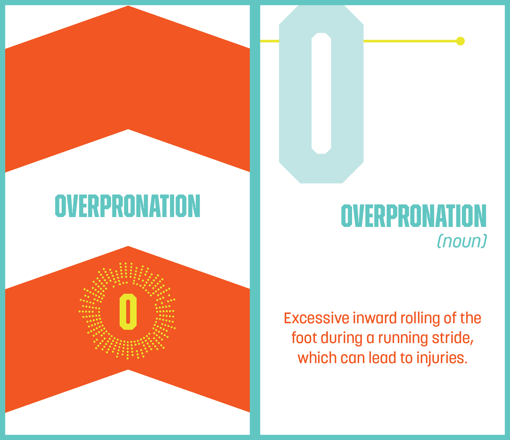
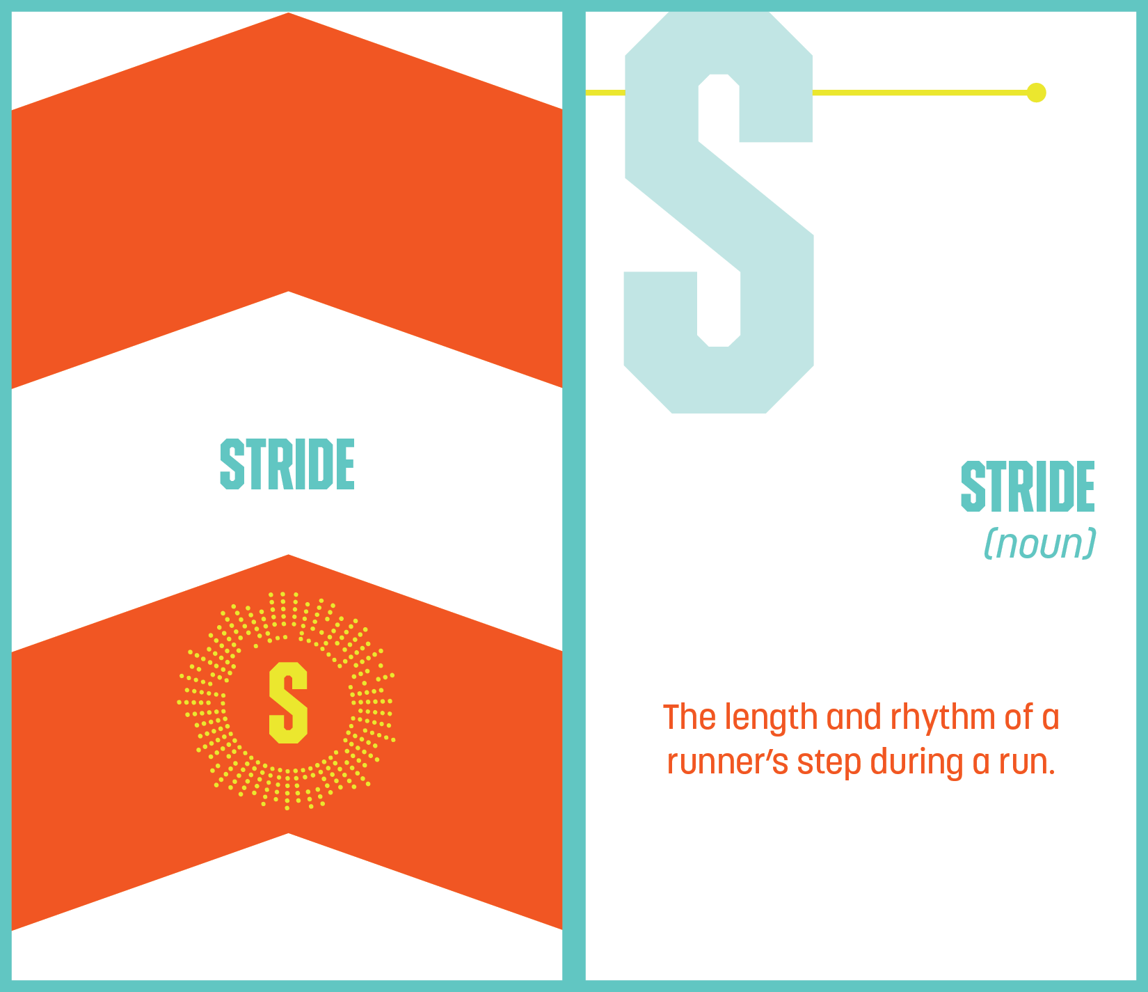
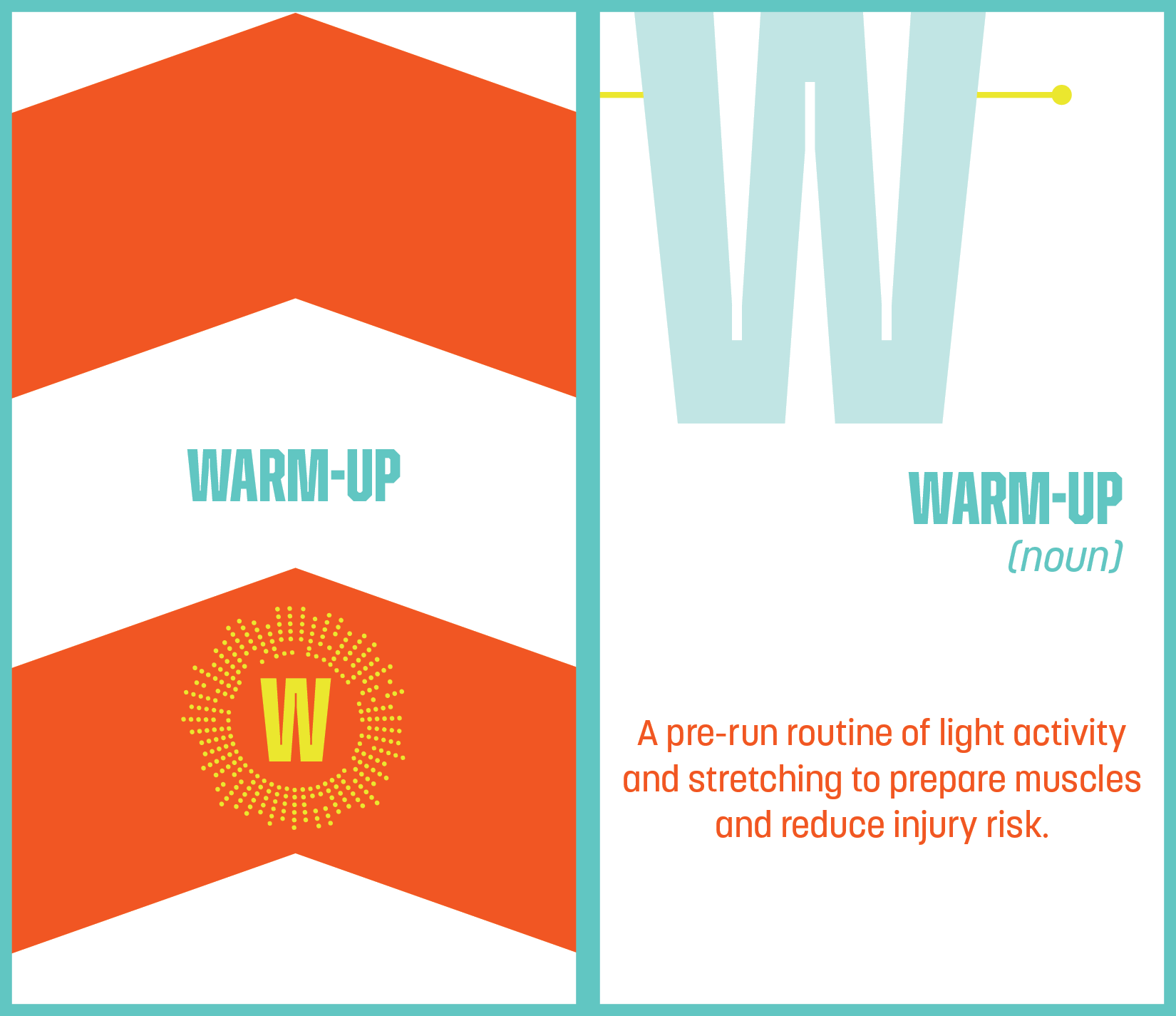
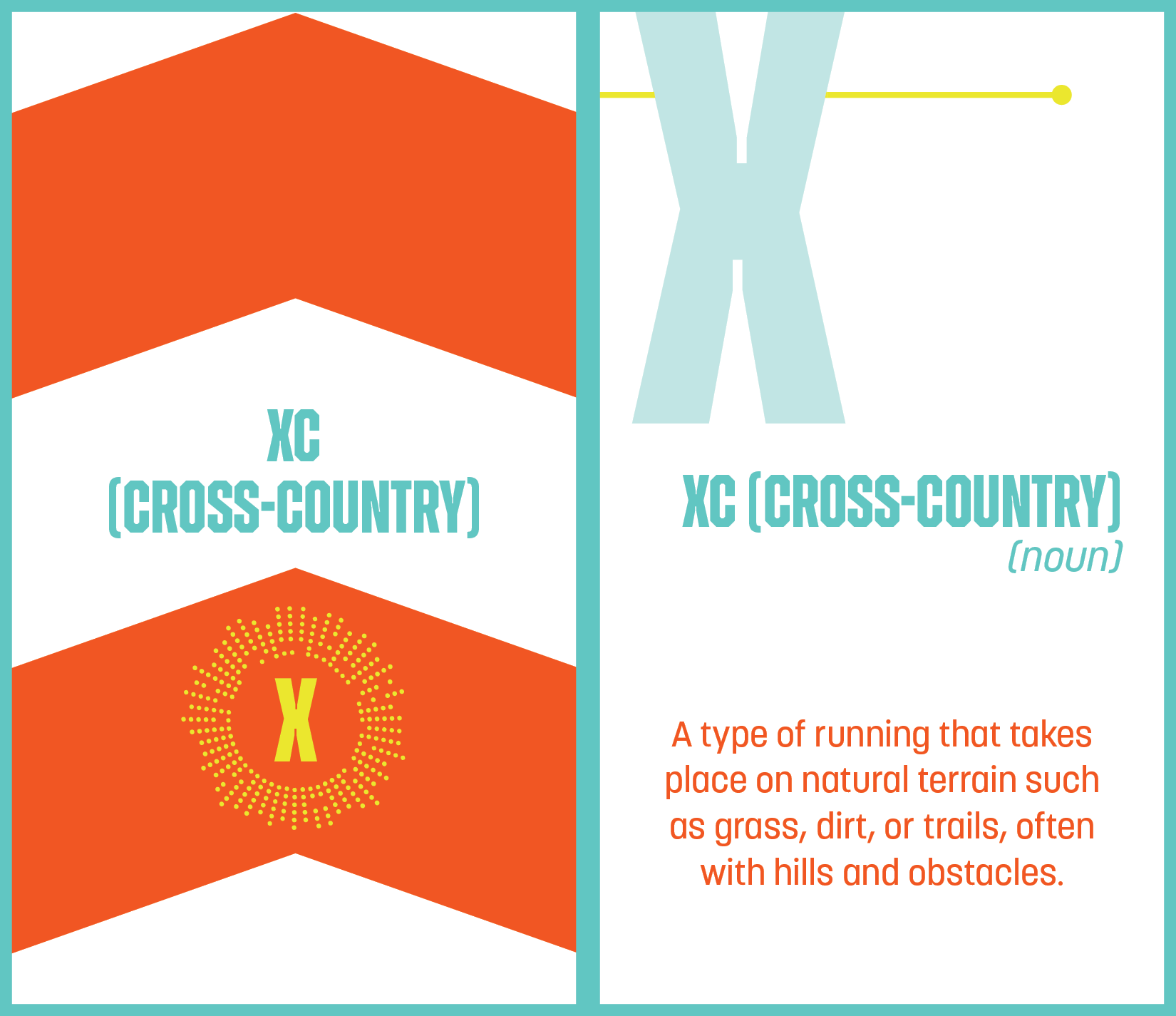
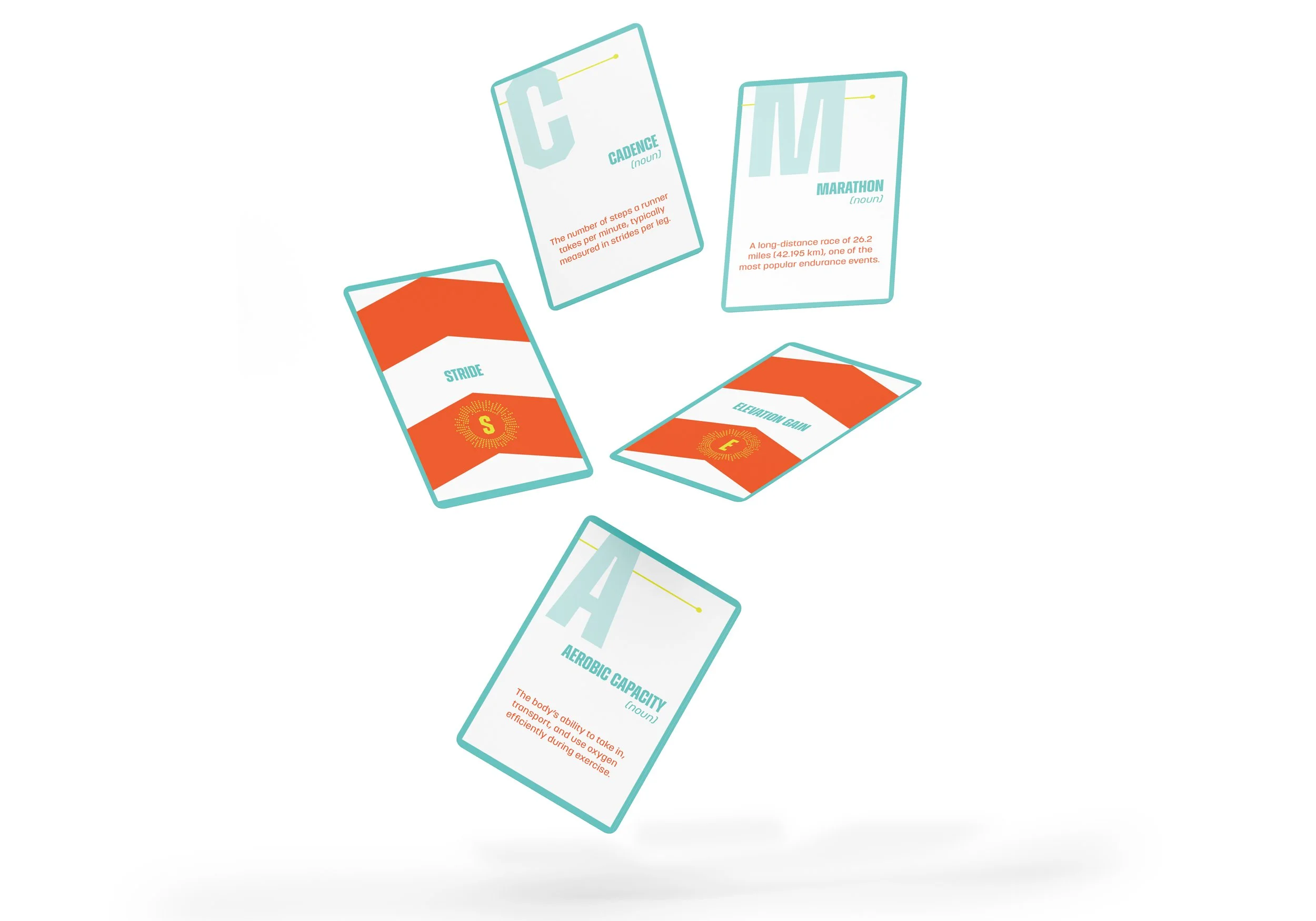
For this project, I created a set of 26 alphabet cards, each highlighting a key concept in running, from "Aerobic Capacity" to "Zone Training." I focused on building a strong grid structure that allowed bold typography to take center stage and reflected the loud and high-energy nature of the sport. Color, composition, and type choices were designed to capture the movement and intensity of running. Additionally, I developed an analog logotype for the card box through hands-on experimentation with materials like black tape, rope, and paint. The final design system is dynamic, structured, and high-impact, mirroring the sport’s power and energy.
sketches

analog logo type explorations

systems


card flats a-z